
Growing up, I was taught that pink and red should never be paired. Their status as similar, but different, shades of the same color was thought to be gaudy and clashing. Today, the palette has been championed by giants of design like Valentino and Gucci, and no longer holds these old associations. Kate Upton’s living room color scheme is the perfect example of how to pair these tones so they look chic, not overwhelming.
The actress and her baseball player husband, Justin Verlander, worked with John Ruggiero Studio to fill their New York apartment with warm, evocative color. Their living room is especially striking in the way it pairs pale pink walls with a deep red sofa. Rather than clashing, they use a contrasting green-yellow palette across the rug and accent chair and warming wood pieces to make the combination look earthy and grounded. Pink books and a red vase on the organically shaped coffee table pull the disparate elements together. Varied textures, including velvet, sponged walls, and a fluted glass light fixture, create an inviting atmosphere.
Looking at the space, it’s a masterclass in decorating a pink room, full of lessons in how to make this villainized scheme shine. Below, I have curated an edit of products to emulate Kate’s look, and gathered the best expert quotes on how to combine the colors. With Kate’s method, you can’t go wrong pairing pink and red.
Kate Upton’s living room demonstrates that experimenting with a ‘clashing’ color palette can also be one of the chicest options.
Marianne Shillingford, Creative Director and Color Expert at Dulux, shares her insights on the topic, stating: ‘So many of us grew up being told to steer clear of ‘clashing’ colors, as if they’re something to be afraid of. But what’s fascinating is that those very contrasts often turn out to be the most complementary combinations of all.’
Recreate Kate and Justin’s Look at Home
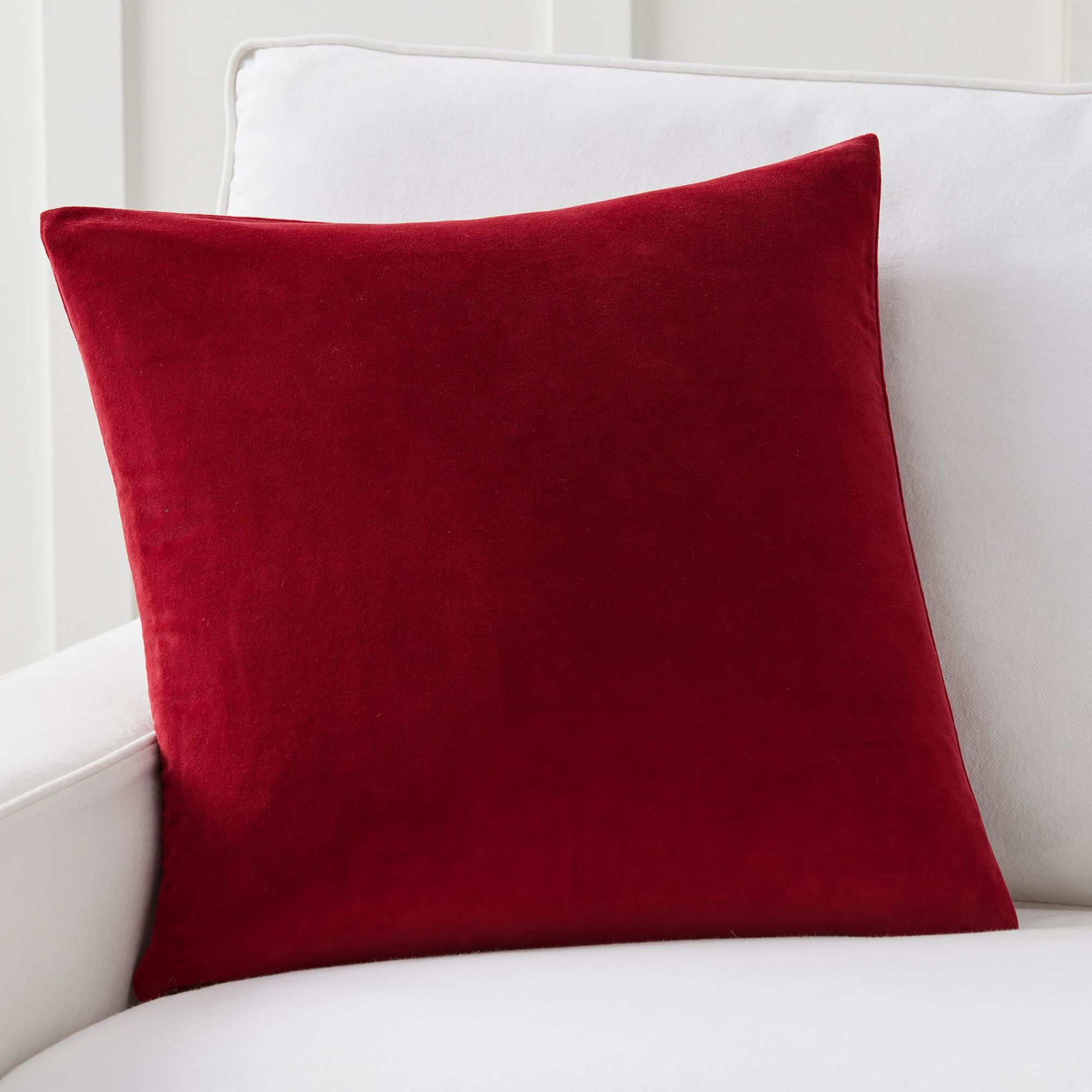 Pop of color
Bring some joy into your home with this vivid red pillow cover. It’s ideal for adding dimension to any color scheme, but it’s guaranteed to look spectacular against a pale pink backdrop.
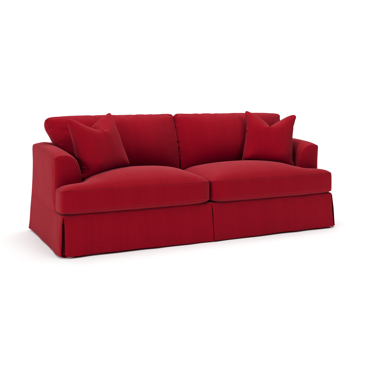 Sleeper Capability
This pretty red sofa is the perfect complement to pale pink walls to add instant interest to a cozy living room. It includes a pull out bed, so is the perfect option for those who like to host guests.
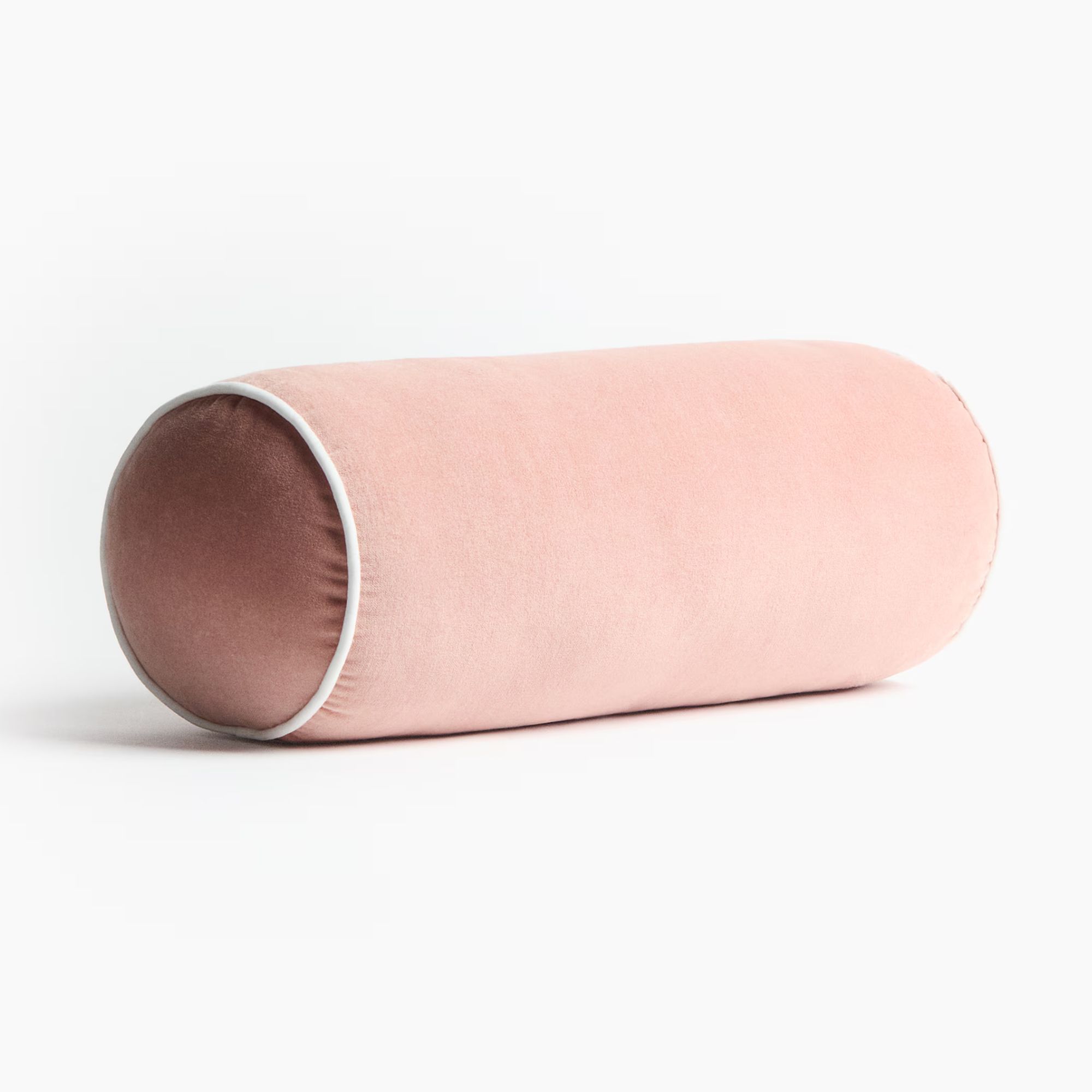 Elegant addition
If you don’t fancy splurging on painting your walls, you can still channel Kate’s style with a bolster cushion like this one. It incorporates pink hues, gentle curves, and luxe texture.
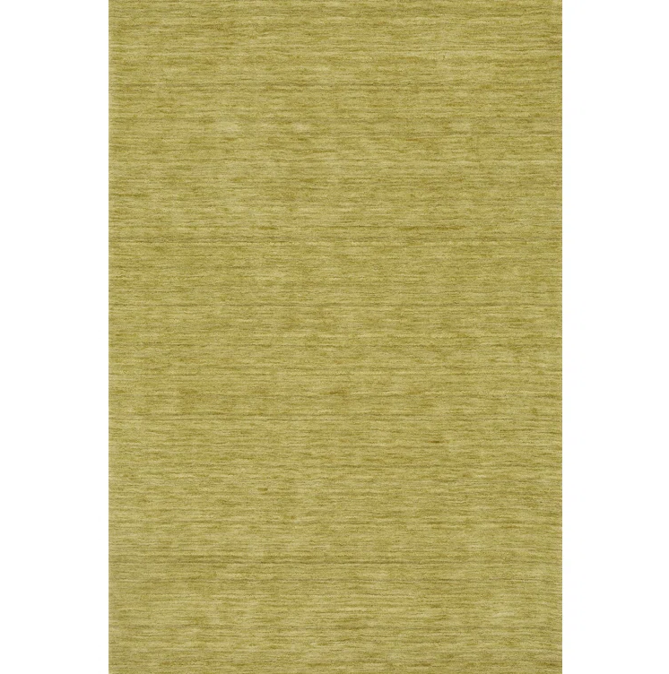 100% wool
Crafted by hand on traditional looms, this 100% wool rug showcases rich texture and depth through its Gabbeh-dyed yarns. In a soothing green palette, multiple tonal shades are woven together to create a layered, organic look that feels both natural and sophisticated in any living room.
 Great Deal
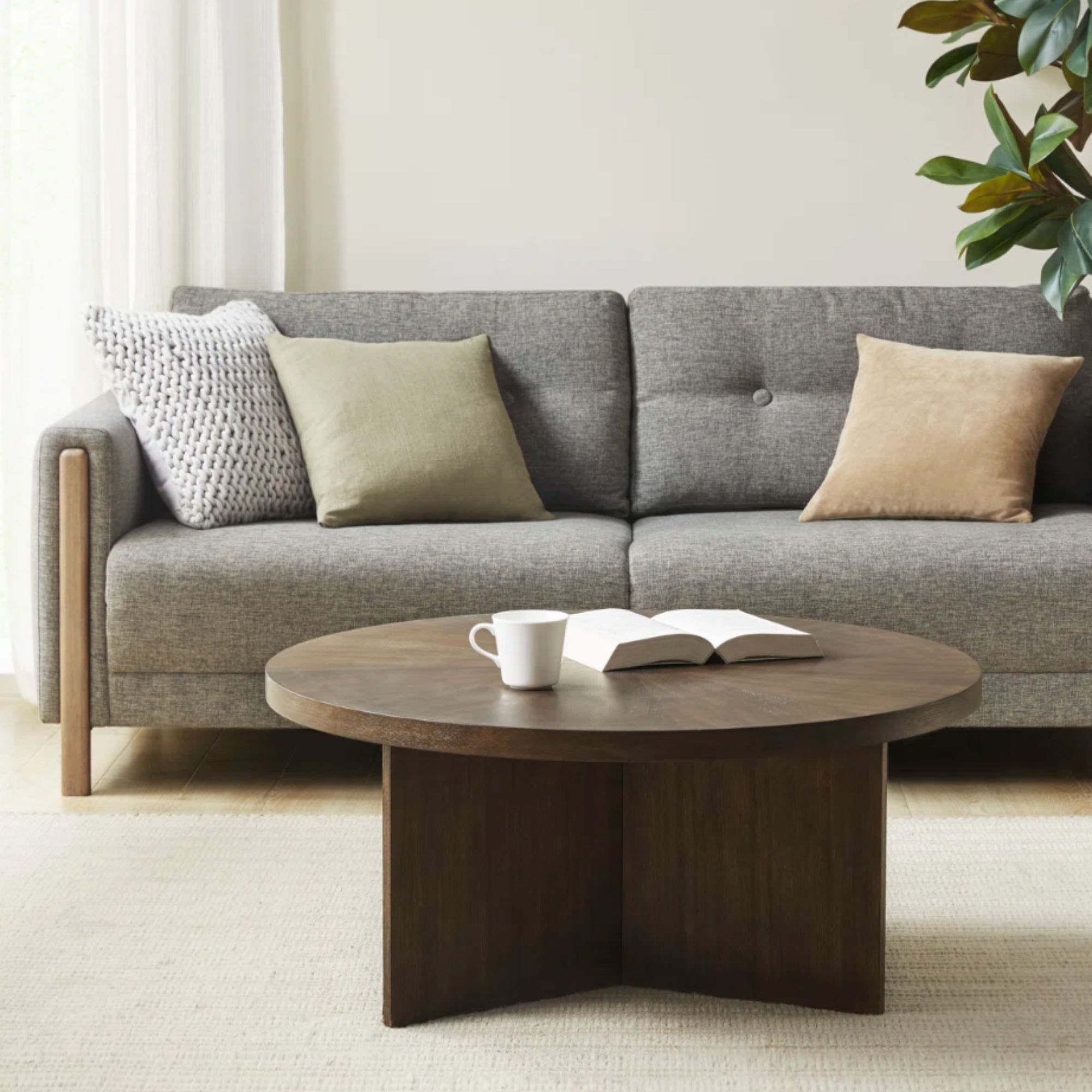
With its solid veneer top and starburst pattern, this walnut coffee table is incredibly versatile yet stylish. It is simple and elegant in any style living area, and at just over $200, the price can’t be beat. Its subtle curves have the same organic feel as much more expensive pieces.
 Editor’s Pick
Kate uses pink coffee table books on her wooden coffee table to create a connection to the rest of the room, and this Sophia Coppola archive tome is my top pick for recreating the look. Pieces of film history plus design sensibility? We couldn’t be happier.
The first lesson in pairing pink and red is the power of introducing a connection to nature. Injections of green and natural wood make the bold pairing feel calm. Marianna explains: ‘Color is all about how we see the world and how it makes us feel, and that goes right back to nature. Our brains are incredibly comfortable with contrast because we’ve evolved alongside it. Think about vibrant red berries standing out against the green of a bush – that contrast isn’t jarring, it’s clear, balanced, and beautiful.’
Next, though Kate uses blush pink walls, the real color work of her living room is in the sofa, rug, and cushions. ‘Contrast doesn’t have to begin with paint,’ advises Marianne. ‘Soft furnishings and accessories are a great way to experiment, build confidence and see what works. Using softened or dustier versions of opposing colors keeps the effect balanced, adding interest without overpowering the room.’ This technique makes it easier to play around and pivot directions if something doesn’t work.
Furthermore, the use of velvet decor in Kate Upton’s space makes it feel cocooning and welcoming. Liv Conlon, Interiors Expert at The Property Stagers, explains: ‘Instead of bold prints or highly trend-led patterns, texture is doing the heavy lifting. Natural materials such as wood, stone, limewash finishes, and woven textiles add interest without overwhelming a space. Texture-led interiors age far better and allow homeowners to refresh a space without a full redesign.’
By introducing natural materials, using soft furnishings, and incorporating a variety of textures, you can make any ‘clashing’ palette feel ultra-chic. With the right styling choices, traditional color ‘rules’ go out the window.
Love celebrity news and interior design inspiration? Sign up for our newsletter and get the latest features delivered straight to your inbox.
Like this article? For more stories like this, follow us on MSN by clicking the +Follow button at the top of this page.