In March 2026, Montecito-based designer and author Kiki Astor told TikTok there is only one best bedroom paint colour for an old money feel. Her quietly luxurious choice overturns blue-and-white advice and might already be in your decorator’s aisle.
For years, anyone searching for the best bedroom paint colour has probably been told to go white for calm or blue for sleep. Yet one interior designer with impeccable old money credentials is adamant those go to shades are getting it wrong.
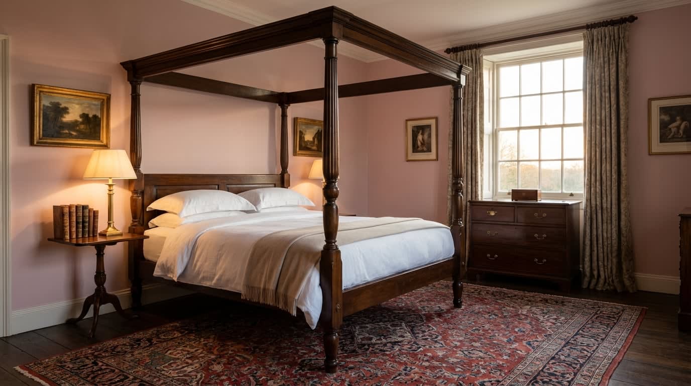
Romance author and interior designer Kiki Astor, who describes herself as a former rich person and has lived in Montecito, California, home to Prince Harry and Meghan, recently went viral on TikTok for naming a single colour she says instantly gives a bedroom a discreet, heritage luxury feel. The twist is that it is much softer than most people expect.
The TikTok designer challenging classic bedroom paint ideas
Kiki Astor has spent years inside the kind of grand houses that inspire the old money aesthetic, the look now copied everywhere thanks to series like Bridgerton and Downton Abbey. Her view is that a bedroom should feel like a private suite, not just a practical sleeping space.
“There’s only one appropriate colour to paint your bedroom in the old money aesthetic. Some of you won’t like it, so go ahead and prove me wrong,” she said in a TikTok video reported by Express.
She poked fun at standard decorating advice on blue bedrooms, saying: “Oh, I know that psychologists say, ‘Oh, you should have a blue bedroom, it promotes sleep, it’s so restful’, what do they know about style?”
For anyone still drawn to blue, she stresses that the walls must be balanced with art, Persian rugs and brown furniture, warning: “If you don’t do that, it’s going to look like a nursery. Don’t say I didn’t warn you,” she elaborated.
Astor also rejects plain white, arguing that while it works in galleries, it rarely delivers the soft, cocooned feeling most people actually want when they close the bedroom door.
Why white, blue and green fall short of a luxury bedroom look
Her verdict on green is just as sharp. “I know that I’ve said that green is the most old money colour to paint most rooms in your house, but not your bedroom,” she clarified, explaining that green walls can cast an unflattering tone on skin when you are getting dressed or undressed.
Red and grey are firmly off her list too: “Not red, that awakens passions. Do not paint it grey, people used to know how to use grey appropriately, that knowledge has been lost.”
This leaves many of the usual bedroom choices either too cold and gallery like, too childish, or simply too harsh for a space where you see your face first thing in the morning.
Viewers recognised themselves in her warnings. One commented: “My primary room was going to be green. I am yellow toned. Thank you for saving me from myself.”
Others shared how they had already followed her advice without knowing it. “As a lady with a pink bedroom who told her husband it’s beige… yes,” wrote one, while another agreed: “This is true y’all it’s the cosiest possible colour.” Not everyone was sold on paint alone though, with one user joking: “Old money here! We actually wallpaper our walls.” Another laughed: “I’m no money and my bedroom is the landlord special.”
How to choose and use neutral pink for an ‘old money’ bedroom
So what is the shade Astor swears by? “The only appropriate colour to paint a bedroom is pink,” she proclaimed. “Not bubblegum pink, not hot pink. No, you paint it the sort of neutral pink that you can tell your husband is beige. He’ll believe you. I promise he believes everything you say,” she added with a hint of humour.
Design wise, this neutral pink is closer to powder pink or blush than to anything sugary. A professional painter with more than 25 years of experience explains that a refined powder pink usually starts with a very opaque white base, then adds red pigments plus a touch of ochre or black so the colour stays soft and slightly greyed rather than bright.
Light is the biggest trap. Painters call it metamerism, the way a colour looks totally different under shop lighting, north facing daylight and warm bedside lamps. The expert advice is to buy a tester, paint a 30×30 cm piece of card with two coats, then move it around the room and check it morning, midday and evening before deciding.
For a small or north facing UK bedroom, a lighter, warmer neutral pink stops the space feeling flat. In a very sunny room you can afford a slightly deeper blush. Finishes matter too: matt gives the softest, powdery look but marks more easily, while a velvet or satin matt finish keeps that plush depth yet is far easier to live with on busy bedroom walls.
To copy the look without stress, focus on a few key steps:
・Prep properly by cleaning, filling and lightly sanding so the pink does not highlight flaws.
・Use a white or pale primer so the final colour reads true rather than muddied.
・Test at least one neutral pink with beige or grey undertones, avoiding anything too peachy or bubblegum.
・Pair the walls with textured linens, dark wood, classic lamps and, if you love blue, art or rugs instead of blue paint.
・Set aside a full weekend if you are a beginner, allowing time for prep, primer and two calm, even coats.